[Python으로 시각화하기]5,6,7강:Matplotlib와 Seaborn
Matlab으로 데이터 시각화하기
데이터를 보기좋게 표현해봅시다.
1. Matplotlib 시작하기
2. 자주 사용되는 Plotting의 Options
- 크기 :
figsize - 제목 :
title - 라벨 :
_label - 눈금 :
_tics - 범례 :
legend
3. Matplotlib Case Study
- 꺾은선 그래프 (Plot)
- 산점도 (Scatter Plot)
- 박스그림 (Box Plot)
- 막대그래프 (Bar Chart)
- 원형그래프 (Pie Chart)
4. The 멋진 그래프, seaborn Case Study
- 커널밀도그림 (Kernel Density Plot)
- 카운트그림 (Count Plot)
- 캣그림 (Cat Plot)
- 스트립그림 (Strip Plot)
- 히트맵 (Heatmap)
5강
1. Matplotlib 시작하기
- 파이썬의 데이터 시각화 라이브러리
cf) 라이브러리 vs 프레임워크
라이브러리 : 개발자들이 만들었을 뿐, 우리가 원하는 목표를 달성하기 위해서는 라이브러리 안의 코드들을 조합해서 결과를 내야한다.(numpy 등)
프레임워크 : 이미 틀이 짜여 있고, 우리는 그 틀에서 내용을 채워가며 결과물을 완성한다.(장고, 플라스크 등)
- matplotlib
matplotlib를 설치한다.
pip3 install matplotlibjupyternotebook에서, matplotlib로 시각화된 결과를 노트북 창에서 확인하도록 하기 위해서는 다음과 같은 특수한 키워드를 적어준다.
%matplotlib inline을 통해서 활성화!
import numpy as np
import pandas as pd
import matplotlib.pyplot as plt

%matplotlib inline
2. Case Study with Arguments
plt.plot([2, 4, 2, 4, 2]) # 실제 plotting을 하는 함수 # y = x + 1
plt.show() # plt를 확인하는 명령
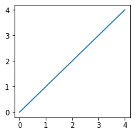
Figsize : Figure(도면)의 크기를 선언
plt.figure(figsize=(3, 3)) # 3*3 사이즈의 plotting을 할 도면을 선언

plt.plot([0, 1, 2, 3, 4]) # 실제 plotting을 하는 함수 # y = x + 1
plt.show() # plt를 확인하는 명령
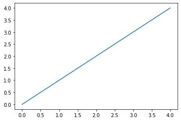
2차함수 그래프 with plot()
# 리스트를 이용해서 1차함수 y=x를 그려보면:

plt.plot([0, 1, 2, 3, 4]) # figure가 지정이 되지 않아 그래프 사이즈가 위와 좀 다르다.
plt.show()
# numpy.array를 이용해서 함수 그래프 그리기
# y=x^2
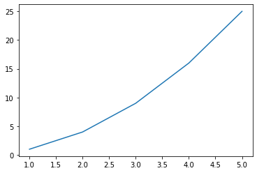
x = np.array([1, 2, 3, 4, 5]) # 정의역
y = np.array([1, 4, 9, 16, 25]) # f(x)
plt.plot(x, y)
# 찍은 점이 5개밖에 없어서 곡선이 매끄럽지 못하다.
[<matplotlib.lines.Line2D at 0x120b68ee0>]
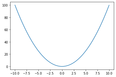
# 찍은 점을 무수히 많게 해서 매끄러운 곡선을 만들 것이다.
# np.arange(a, b, c) : a에서 b까지 c만큼 증가하는 범위를 만든다. c:0.01을 주어 무수히 많은 점을 만들 것이다.

x = np.arange(-10, 10, 0.01)
plt.plot(x, x**2)
plt.show()

# 우리가 익히 잘 알고 있는 2차함수의 곡선이 그려진다!
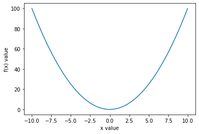
# x, y축에 설명 추가하기

x = np.arange(-10, 10, 0.01)
### 추가된 부분
plt.xlabel("x value")
plt.ylabel("f(x) value")
###
plt.plot(x, x**2)
plt.show()
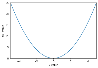
# x, y축의 범위를 설정하기

x = np.arange(-10, 10, 0.01)

plt.xlabel("x value")
plt.ylabel("f(x) value")
### 추가된 부분
plt.axis([-5, 5, 0, 25]) # [x_min, x_max, y_min, y_max]
###
plt.plot(x, x**2)
plt.show()

# axis로 설정한 범위 안의 그래프만 출력되는 것을 볼 수 있다.
# x, y축에 눈금 설정하기

x = np.arange(-10, 10, 0.01)

plt.xlabel("x value")
plt.ylabel("f(x) value")
plt.axis([-5, 5, 0, 25]) # [x_min, x_max, y_min, y_max]
### 추가된 부분
# tick은 눈금을 의미한다. list comprehension을 사용할 수 있다.
plt.xticks([i for i in range(-5, 6, 1)]) # x축의 눈금 설정, -5, -4, -4, ...
plt.yticks([i for i in range(0, 27, 3)]) # y축의 눈금 설정
###
plt.plot(x, x**2)
plt.show()
![png/assets/images/2020-12-17-matplotlib_and_seaborn_files/2020-12-17-matplotlib_and_seaborn_16_0.png)
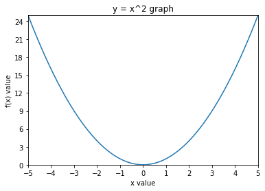
# 그래프에 title 달기
x = np.arange(-10, 10, 0.01)

plt.xlabel("x value")
plt.ylabel("f(x) value")
plt.axis([-5, 5, 0, 25]) # [x_min, x_max, y_min, y_max]
plt.xticks([i for i in range(-5, 6, 1)]) # x축의 눈금 설정, -5, -4, -4, ...
plt.yticks([i for i in range(0, 27, 3)]) # y축의 눈금 설정
### 추가된 부분
plt.title("y = x^2 graph")
###
plt.plot(x, x**2)
plt.show()
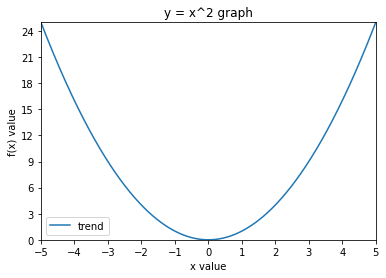
# 범례를 달기
x = np.arange(-10, 10, 0.01)

plt.xlabel("x value")
plt.ylabel("f(x) value")
plt.axis([-5, 5, 0, 25]) # [x_min, x_max, y_min, y_max]
plt.xticks([i for i in range(-5, 6, 1)]) # x축의 눈금 설정, -5, -4, -4, ...
plt.yticks([i for i in range(0, 27, 3)]) # y축의 눈금 설정
plt.title("y = x^2 graph")
### 추가된 부분
plt.plot(x, x**2, label="trend") # 파란색 선이 "trend"라는 범례라고 설정
plt.legend()
###
plt.show()
6강
3. Matplotlib Case Study
꺾은선 그래프(Plot)
.plot()
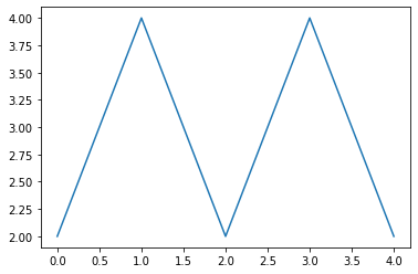
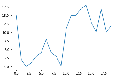
# plot을 이용해 꺾은선 그래프를 만들 수 있다.
x = np.arange(20) # 0~19
y = np.random.randint(0, 20, 20) # 0부터 20까지의 수 중에서 난수를 20번 생성
plt.plot(x, y) # 랜덤 난수이기 때문에 꺾은선 그래프의 추세를 확인할 수는 없다.
plt.show()
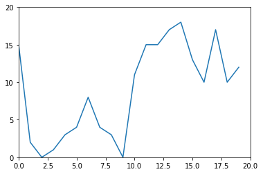
# Extra : y축을 20까지 보이게 하고싶다면?, y축을 "5"단위로 보이게 하고 싶다면?
# .axis(), .yticks()
# y축을 20까지 보이게 하고싶다면?
plt.plot(x, y)

plt.axis([0, 20, 0, 20])
plt.yticks([0, 5, 10, 15, 20])
plt.show()
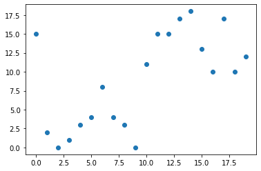
산점도(Scatter Plot)
.scatter()
꺾은선 그래프는 시계열 데이터에서 많이 사용한다.
시계열 데이터 : x축이 시간, y축이 그에 대한 변수
산점도는 x와 y가 완전히 별개의 변수일때 많이 사용한다.
# scatter를 이용해 산점도를 만들 수 있다.
plt.scatter(x, y)
plt.show()
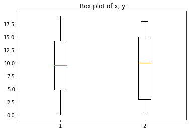
박스 그림(Box Plot)
- 수치형 데이터에 대한 정보(사분위수에서 Q1(25%), Q2(50%), Q3(75%), min, max)
plt.boxplot((x, y))
# plt.boxplot(x)
# plt.boxplot(y)

# T자 처럼 생긴 상한선과 하한선이 변수 y의 single min, max 값을 보여준다.
# 가로선이 총 3가지인데, 맨 아래의 가로선은 Q1(백분위에서 25%)
# 가운데의 주황색 선은 Q2(중앙값, 백분위에서 50%)
# 마지막 선은 Q3(백분위에서 75%)

# Extra : Plot의 title을 "Box plot of x, y"라고 지정해보자.
plt.title("Box plot of x, y")
plt.show()
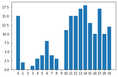
막대 그래프(Bar Plot)
- 범주형 데이터의 “값”과 그 값의 크기를 직사각형으로 나타낸 그림
.bar()
plt.bar(x, y)
# Extra : xticks를 올바르게 처리해봅시다.
plt.xticks(np.arange(0, 20, 1)) #x의 범위를 0부터 20까지 1간격으로
plt.show()
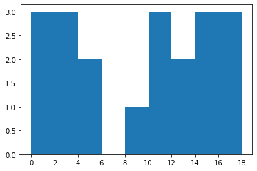
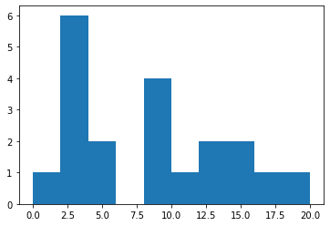
# cf) Histogram
# .hist()
# 도수분포를 직사각형의 막대 형태로 나타냈다.
# 막대그래프는 x축에 각 변량들이 있는데, 히스토그램은 여러 변량을 그룹으로 묶는다.
# 여러 변량을 그룹으로 묶은 것이 "계급"
# "계급"으로 나타낸 것이 특징 : 0, 1, 2가 아니라 0~2까지의 "범주형"데이터로 구성 후 그림을 그림

plt.hist(y, bins=np.arange(0, 20, 2)) # 0부터 20까지 2개씩 범주로 묶기
plt.xticks(np.arange(0, 20, 2)) # Extra : xticks를 올바르게 처리해봅시다.
plt.show()
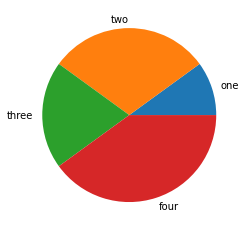
원형 그래프(Pie Chart)
- 데이터에서 전체에 대한 부분의 비율을 부채꼴로 나타낸 그래프
- 다른 그래프에 비해서 비율 확인에 용이
.pie()
z = [100, 300, 200, 400] # 데이터

plt.pie(z, labels=['one', 'two', 'three', 'four']) # 파이차트는 무조건 데이터와 대응되는 라벨을 붙여줄 것!!
plt.show()
7강
7. The 멋진 그래프, Seaborn Case Study
Matplotlib를 기반으로 더 다양한 시각화 방법을 제공하는 라이브러리
- 커널밀도그림
- 카운트그림
- 캣그림
- 스트립그림
- 히트맵
Seaborn Import 하기
!pip3 install seaborn
Collecting seaborn
Downloading seaborn-0.11.0-py3-none-any.whl (283 kB)
[K |████████████████████████████████| 283 kB 501 kB/s eta 0:00:01
[?25hRequirement already satisfied: numpy>=1.15 in /usr/local/lib/python3.9/site-packages (from seaborn) (1.19.4)
Requirement already satisfied: pandas>=0.23 in /usr/local/lib/python3.9/site-packages (from seaborn) (1.1.5)
Requirement already satisfied: matplotlib>=2.2 in /usr/local/lib/python3.9/site-packages (from seaborn) (3.3.3)
Requirement already satisfied: pyparsing!=2.0.4,!=2.1.2,!=2.1.6,>=2.0.3 in /usr/local/lib/python3.9/site-packages (from matplotlib>=2.2->seaborn) (2.4.7)
Requirement already satisfied: kiwisolver>=1.0.1 in /usr/local/lib/python3.9/site-packages (from matplotlib>=2.2->seaborn) (1.3.1)
Requirement already satisfied: cycler>=0.10 in /usr/local/lib/python3.9/site-packages (from matplotlib>=2.2->seaborn) (0.10.0)
Requirement already satisfied: python-dateutil>=2.1 in /usr/local/lib/python3.9/site-packages (from matplotlib>=2.2->seaborn) (2.8.1)
Requirement already satisfied: numpy>=1.15 in /usr/local/lib/python3.9/site-packages (from seaborn) (1.19.4)
Requirement already satisfied: pillow>=6.2.0 in /usr/local/lib/python3.9/site-packages (from matplotlib>=2.2->seaborn) (8.0.1)
Requirement already satisfied: six in /usr/local/lib/python3.9/site-packages (from cycler>=0.10->matplotlib>=2.2->seaborn) (1.15.0)
Requirement already satisfied: pytz>=2017.2 in /usr/local/lib/python3.9/site-packages (from pandas>=0.23->seaborn) (2020.4)
Requirement already satisfied: python-dateutil>=2.1 in /usr/local/lib/python3.9/site-packages (from matplotlib>=2.2->seaborn) (2.8.1)
Requirement already satisfied: numpy>=1.15 in /usr/local/lib/python3.9/site-packages (from seaborn) (1.19.4)
Requirement already satisfied: six in /usr/local/lib/python3.9/site-packages (from cycler>=0.10->matplotlib>=2.2->seaborn) (1.15.0)
Collecting scipy>=1.0
Downloading scipy-1.5.4-cp39-cp39-macosx_10_9_x86_64.whl (29.1 MB)
[K |████████████████████████████████| 29.1 MB 4.1 MB/s eta 0:00:01
[?25hRequirement already satisfied: numpy>=1.15 in /usr/local/lib/python3.9/site-packages (from seaborn) (1.19.4)
Installing collected packages: scipy, seaborn
Successfully installed scipy-1.5.4 seaborn-0.11.0
import seaborn as sns
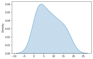
커널밀도그림(Kernel Density Plot)
- 히스토그램과 같은 연속적인 분포를 곡선화해서 그린 그림
sns.kdeplot()
# in Histogram 히스토그램 복습!

x = np.arange(0, 22, 2) # 간격을 정해주기
y = np.random.randint(0, 20, 20) # 0~20까지의 수 중에서 20번 샘플링

plt.hist(y, bins=x)
plt.show()
# kdeplot
# 스무스한 곡선이 그려진다.
# y 값은 도수이고, kdeplot의 density는 전체를 1이라고 봤을때 어느 정도의 density를 갖는지 보여준다.

sns.kdeplot(y, shade=True) # False로 하면 색칠이 없어짐

plt.show()
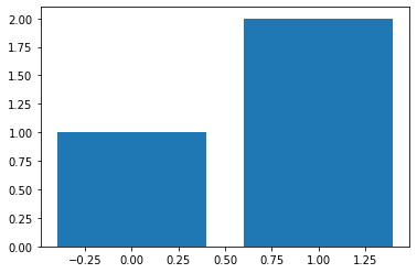
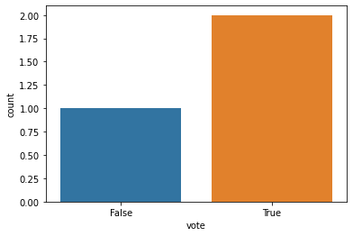
카운트그림(Count Plot)
- 범주형 column의 빈도수를 시각화 -> Groupby 후의 도수를 하는 것과 동일한 효과
sns.countplot()
vote_df = pd.DataFrame({"name":['Andy', 'Bob', 'Cat'], "vote":[True, True, False]})

vote_df
# 이제 True와 False의 빈도를 시각화해볼 것이다.
| name | vote | |
|---|---|---|
| 0 | Andy | True |
| 1 | Bob | True |
| 2 | Cat | False |
# in matplotlib barplot

vote_count = vote_df.groupby('vote').count()

vote_count
| name | |
|---|---|
| vote | |
| False | 1 |
| True | 2 |
plt.bar(x=[False,True], height=vote_count['name'])

plt.show()
# sns의 countplot
# 이제 seaborn으로 그려보자! 시각적으로 더 보기 좋다.

sns.countplot(x=vote_df["vote"])
plt.show()
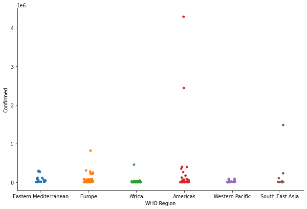
캣그림(Cat Plot)
- 숫자형 변수와 하나 이상의 범주형 변수의 관계를 보여주는 함수
sns.catplot()
covid = pd.read_csv("./archive/country_wise_latest.csv")

covid.head(5)
| Country/Region | Confirmed | Deaths | Recovered | Active | New cases | New deaths | New recovered | Deaths / 100 Cases | Recovered / 100 Cases | Deaths / 100 Recovered | Confirmed last week | 1 week change | 1 week % increase | WHO Region | |
|---|---|---|---|---|---|---|---|---|---|---|---|---|---|---|---|
| 0 | Afghanistan | 36263 | 1269 | 25198 | 9796 | 106 | 10 | 18 | 3.50 | 69.49 | 5.04 | 35526 | 737 | 2.07 | Eastern Mediterranean |
| 1 | Albania | 4880 | 144 | 2745 | 1991 | 117 | 6 | 63 | 2.95 | 56.25 | 5.25 | 4171 | 709 | 17.00 | Europe |
| 2 | Algeria | 27973 | 1163 | 18837 | 7973 | 616 | 8 | 749 | 4.16 | 67.34 | 6.17 | 23691 | 4282 | 18.07 | Africa |
| 3 | Andorra | 907 | 52 | 803 | 52 | 10 | 0 | 0 | 5.73 | 88.53 | 6.48 | 884 | 23 | 2.60 | Europe |
| 4 | Angola | 950 | 41 | 242 | 667 | 18 | 1 | 0 | 4.32 | 25.47 | 16.94 | 749 | 201 | 26.84 | Africa |
s = sns.catplot(x='WHO Region', y='Confirmed', data=covid, kind='strip') # kind = 'strip', 'violin', ... 그래프의 형태를 바꿀 수 있다!
s.fig.set_size_inches(10, 6) # 그래프의 사이즈를 지정해서 보기 편하게~
plt.show()
# Region 별 확진자 수를 볼 수 있다.
# 범주형 데이터와 수치형 데이터를 매핑하는데 좋은 효과!
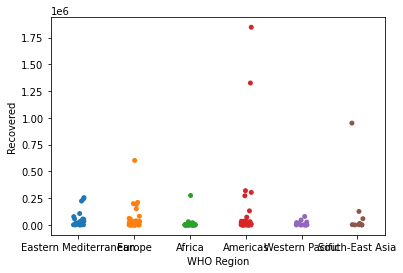
스트립그림(Strip Plot)
- scatter plot과 유사하게 데이터의 수치를 표현하는 그래프
sns.stripplot()
s = sns.stripplot(x='WHO Region', y='Recovered', data=covid)

plt.show()
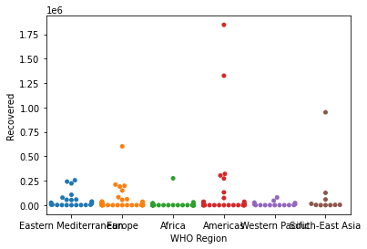
# cf) swarmplot
# 유사한 점들이 겹치는 경우, 양 옆으로 분산해서 한눈에 해당하는 값들이 얼마나 있는지 확인하기 쉽다.

s = sns.swarmplot(x='WHO Region', y='Recovered', data=covid)

plt.show()
# 오류 발생하는 이유는, 점들의 값이 너무 크다보니 주어진 데이터를 다 표현할 수 없다는 워닝이라 일단은 무시해도 됨!
/usr/local/lib/python3.9/site-packages/seaborn/categorical.py:1296: UserWarning: 22.7% of the points cannot be placed; you may want to decrease the size of the markers or use stripplot.
  warnings.warn(msg, UserWarning)
/usr/local/lib/python3.9/site-packages/seaborn/categorical.py:1296: UserWarning: 69.6% of the points cannot be placed; you may want to decrease the size of the markers or use stripplot.
  warnings.warn(msg, UserWarning)
/usr/local/lib/python3.9/site-packages/seaborn/categorical.py:1296: UserWarning: 79.2% of the points cannot be placed; you may want to decrease the size of the markers or use stripplot.
  warnings.warn(msg, UserWarning)
/usr/local/lib/python3.9/site-packages/seaborn/categorical.py:1296: UserWarning: 54.3% of the points cannot be placed; you may want to decrease the size of the markers or use stripplot.
  warnings.warn(msg, UserWarning)
/usr/local/lib/python3.9/site-packages/seaborn/categorical.py:1296: UserWarning: 31.2% of the points cannot be placed; you may want to decrease the size of the markers or use stripplot.
  warnings.warn(msg, UserWarning)
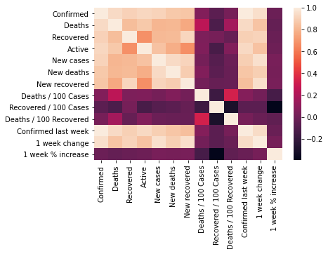
히트맵(Heatmap)
- 데이터의 행렬을 색상으로 표현해주는 그래프
sns.heatmap()- 가장 많이 사용하는 예시가 바로 상관계수!
# 히트맵 예제
covid.corr() # covid 데이터의 상관계수
| Confirmed | Deaths | Recovered | Active | New cases | New deaths | New recovered | Deaths / 100 Cases | Recovered / 100 Cases | Deaths / 100 Recovered | Confirmed last week | 1 week change | 1 week % increase | |
|---|---|---|---|---|---|---|---|---|---|---|---|---|---|
| Confirmed | 1.000000 | 0.934698 | 0.906377 | 0.927018 | 0.909720 | 0.871683 | 0.859252 | 0.063550 | -0.064815 | 0.025175 | 0.999127 | 0.954710 | -0.010161 |
| Deaths | 0.934698 | 1.000000 | 0.832098 | 0.871586 | 0.806975 | 0.814161 | 0.765114 | 0.251565 | -0.114529 | 0.169006 | 0.939082 | 0.855330 | -0.034708 |
| Recovered | 0.906377 | 0.832098 | 1.000000 | 0.682103 | 0.818942 | 0.820338 | 0.919203 | 0.048438 | 0.026610 | -0.027277 | 0.899312 | 0.910013 | -0.013697 |
| Active | 0.927018 | 0.871586 | 0.682103 | 1.000000 | 0.851190 | 0.781123 | 0.673887 | 0.054380 | -0.132618 | 0.058386 | 0.931459 | 0.847642 | -0.003752 |
| New cases | 0.909720 | 0.806975 | 0.818942 | 0.851190 | 1.000000 | 0.935947 | 0.914765 | 0.020104 | -0.078666 | -0.011637 | 0.896084 | 0.959993 | 0.030791 |
| New deaths | 0.871683 | 0.814161 | 0.820338 | 0.781123 | 0.935947 | 1.000000 | 0.889234 | 0.060399 | -0.062792 | -0.020750 | 0.862118 | 0.894915 | 0.025293 |
| New recovered | 0.859252 | 0.765114 | 0.919203 | 0.673887 | 0.914765 | 0.889234 | 1.000000 | 0.017090 | -0.024293 | -0.023340 | 0.839692 | 0.954321 | 0.032662 |
| Deaths / 100 Cases | 0.063550 | 0.251565 | 0.048438 | 0.054380 | 0.020104 | 0.060399 | 0.017090 | 1.000000 | -0.168920 | 0.334594 | 0.069894 | 0.015095 | -0.134534 |
| Recovered / 100 Cases | -0.064815 | -0.114529 | 0.026610 | -0.132618 | -0.078666 | -0.062792 | -0.024293 | -0.168920 | 1.000000 | -0.295381 | -0.064600 | -0.063013 | -0.394254 |
| Deaths / 100 Recovered | 0.025175 | 0.169006 | -0.027277 | 0.058386 | -0.011637 | -0.020750 | -0.023340 | 0.334594 | -0.295381 | 1.000000 | 0.030460 | -0.013763 | -0.049083 |
| Confirmed last week | 0.999127 | 0.939082 | 0.899312 | 0.931459 | 0.896084 | 0.862118 | 0.839692 | 0.069894 | -0.064600 | 0.030460 | 1.000000 | 0.941448 | -0.015247 |
| 1 week change | 0.954710 | 0.855330 | 0.910013 | 0.847642 | 0.959993 | 0.894915 | 0.954321 | 0.015095 | -0.063013 | -0.013763 | 0.941448 | 1.000000 | 0.026594 |
| 1 week % increase | -0.010161 | -0.034708 | -0.013697 | -0.003752 | 0.030791 | 0.025293 | 0.032662 | -0.134534 | -0.394254 | -0.049083 | -0.015247 | 0.026594 | 1.000000 |
sns.heatmap(covid.corr()) # 위의 행렬을 히트맵으로 색을 통해 표현!
plt.show()
# 밝은 색은 양의 상관관계(1에 가까움)를, 어두운 색은 관련이 없음(0에 가까움)를 나타낸다.